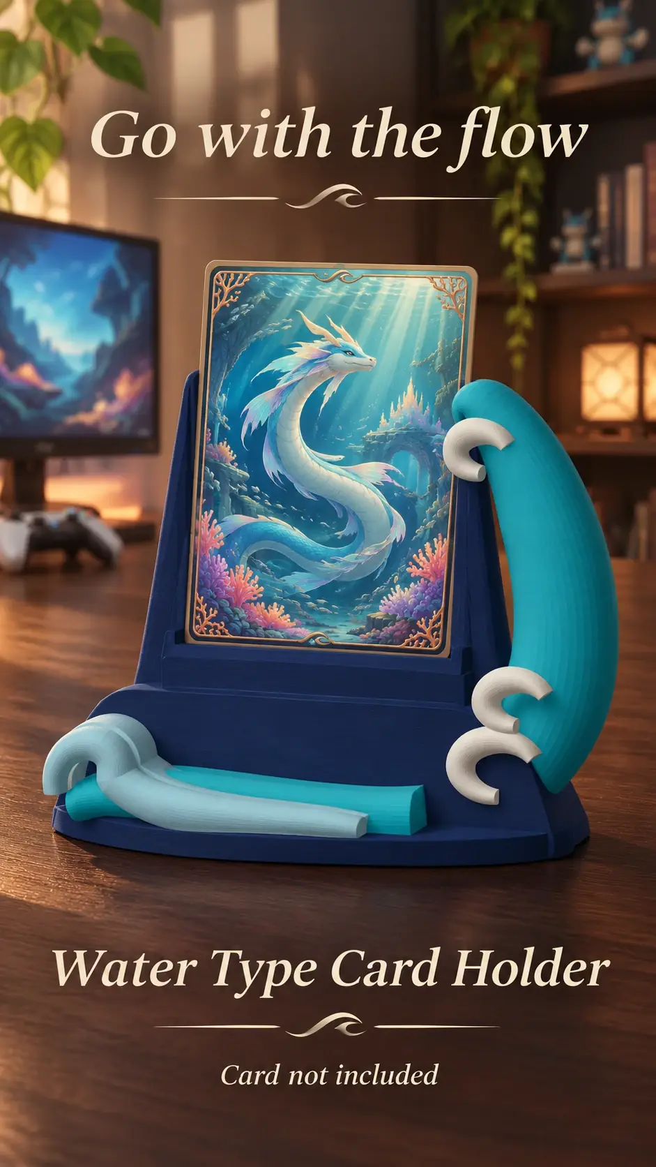
A matching colour can make a display feel coordinated, while a contrasting colour can help it stand out. The card itself should remain the visual focus.
Start with the room
Notice the main shelf and wall colours. Choose a holder palette that fits those surroundings without blending into the background.
Consider the card art
A neutral or complementary support may let bright artwork stand out. Use a preview to assess the combination, remembering that screen colours can differ from the finished item.
Review each selected colour
Check the final preview and options after choosing colours. If a colour code or name is shown, use it to confirm the selection.
Product previews and sample card artwork are for illustration. Check each listing for the holder’s options and dimensions, and confirm card or protector fit before ordering. The designs are independent and fan-inspired; Custom Card Display is not affiliated with or endorsed by Pokémon, One Piece or their rights holders.
READY TO LOOK AROUND?
Find a display for your collection.
Browse the designs and check dimensions and options on each listing.