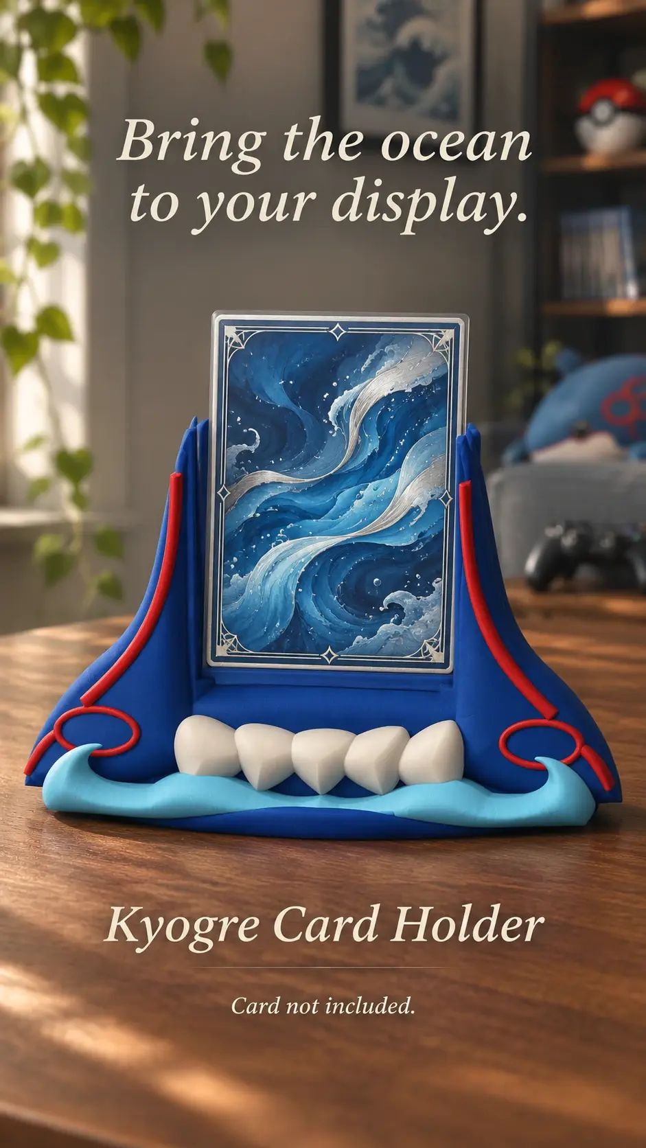
Colour is personal, but a few simple comparisons can help a holder feel at home beside a card and the rest of your collection. Think about what you want to notice first: the artwork, the theme or the whole display.
Let the card artwork lead
If the card has a lot of saturated colour, a neutral holder can give the artwork more room to stand out. Soft white, grey or a restrained dark tone can work as a quiet frame.
For a calmer card, a holder that picks up one colour from the artwork can make the whole piece feel connected. Choose one accent instead of trying to match every colour on the card.
Compare colours in the display spot
A colour can look different under warm desk lighting than it does in daylight. Compare the holder choice with the desk, shelf or nearby objects where it will actually sit.
If you are using several holders, repeat one or two colours across the group. Repetition creates a sense of order even when the designs are different.
Treat digital previews as a guide
Screen colours vary by device, brightness and settings. A preview helps you compare options, but the printed or finished colour may look different in person.
Read the listing’s material and colour notes before choosing. If a specific shade matters, ask the seller what can be confirmed before ordering.
Product previews and sample card artwork are for illustration. Check each listing for the holder’s options and dimensions, and confirm card or protector fit before ordering. The designs are independent and fan-inspired; Custom Card Display is not affiliated with or endorsed by Pokémon, One Piece or their rights holders.
READY TO LOOK AROUND?
Find a display for your collection.
Browse the designs and check dimensions and options on each listing.